

Brief
New Yorkers should be able to access their collection schedules, know which garbage to bring out on certain days, and add pick up dates to their calendars. However, the current NYC government website is difficult to navigate and full of redundancies.
I redesigned the NYC website’s information architecture to make Garbage & Recycling collection schedules more easily accessible.
Scroll down for highlights, or read the full case study on Prototypr:
RESPONSIBILITIES
Comparative Research, Secondary Research, Heuristic Evaluation, Card Sorting, Tree Testing, Site Maps, Content Inventory/Audit, Navigation Study, Mid-Fidelity Wireframing, Prototyping
TOOLS
Sketch, InVision, Optimal Workshop (OptimalSort & Treejack), Google Sheets
Timeline
1.5 weeks
Who is the user?
NYC.gov has 35 million visitors per year. Most visitors are New York City residents looking to pay a bill, get a permit, make a complaint, apply for a city job, or learn about various city policies. NYC.gov serves as a one-stop hub for anything a New Yorker might want to know or do with the city.
Source: “The Redesigned NYC.gov” IXDA.org, 2014

Understanding the Problem Space
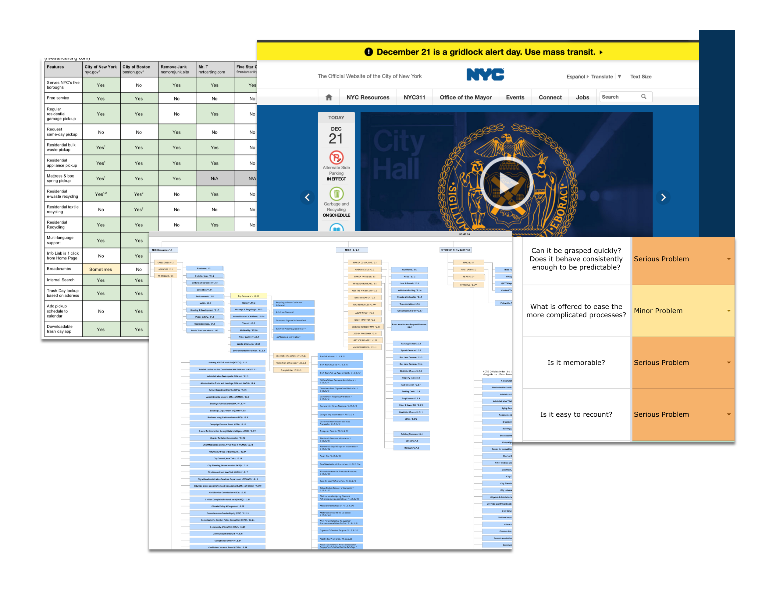
NYC.gov is user-agnostic, i.e. it doesn’t draw users to do one specific action. Unfortunately, most useful information is buried under news and videos from Mayor DeBlasio’s office, as well as seemingly endless clicking and scrolling through links upon links.
On the current website, trash and recycling collection schedules are 6–7 levels deep (view the current sitemap). After conducting a heuristic evaluation and partial content audit, I discovered that the underlying reasons for poor user experience on NYC.gov lay in its information architecture.
A Quick Note
While this assignment was purely conceptual, I have a lot of real love for New York City and really think we deserve the best city we can have—politically, experientially, and digitally.
The scope of this project ignores the newish NYC 311 feature on the website that improves access to services a whole lot more than the old city website did. I hope the team in charge of the current NYC.gov redesign harnesses the power of this resource in a way that is efficient, accessible, and reliable.
Sample Wireframes
Home Page
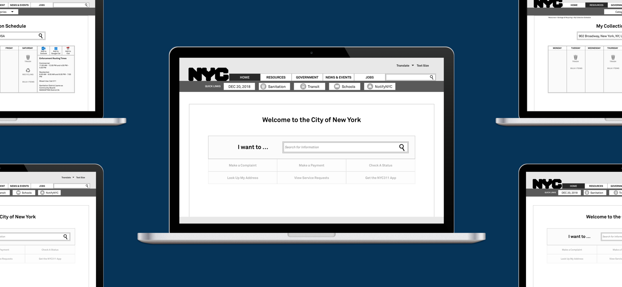
Due to the volume of resources and actions on the NYC website, my revised home page concept uses search as a main driver of the website. Quick links near the top of the page connect users to relevant information, including Trash schedules, in one click.

Trash Collection Schedule
By clicking on Sanitation on the home page’s Quick Links, users are taken to the Collection Schedules page, wherein they can easily look up the trash collection schedules for their address and download the schedules to their calendar.

Garbage & Recycling
Due to its importance as a resource topic for all types of New Yorkers, I proposed to rearrange the NYC.gov sitemap, bringing “Garbage & Recycling” one level higher in the website’s information architecture. Within this new parent category, resource pages are further condensed and contain only the most essential information.

Information for Residents
In an effort to reduce the website’s verbal clutter, child pages under the “Garbage & Recycling” category contain only the most relevant information for residents, businesses, et al. The fixed sidebar contains anchor links along the length of the page.

Case Study
Want to know how I arrived at the mid-fi wireframes and prototype?
My UX case study was published to Prototypr.io and chronicles the rest of my process, including:
insights from usability research (card sorting & tree testing)
proposals for the website redesign
revised user flows
what I learned from the process
Mid-Fi Prototype
If you’re on a desktop, you can view the mid-fidelity prototype on InVision by clicking on the button below: